Introduction
The first step of an analysis is to summarize the data, since data which have not been organized in any way are not very easy to understand. It often helps to illustrate them with a diagram, which should always be clearly labelled and self-explanatory.
Frequencies (Qualitative Data)
Summarizing qualitative data is very straightforward, the main task being to count the number of observations in each category. These counts are called frequencies. They are often also presented as relative frequencies, that is as percentages of the total number of individuals.
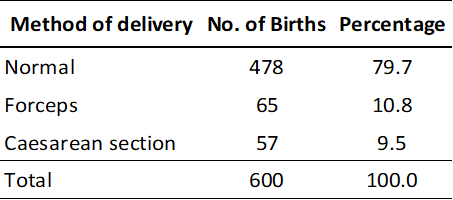
[!example]+ Example 2.1 The table below summarizes the method of delivery recorded for 600 births in a hospital. The variable of interest is the method of delivery, a qualitative variable with three categories, normal delivery, forceps delivery, and caesarean section.
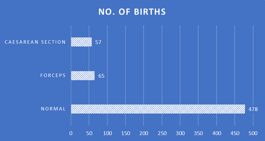
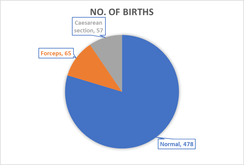
Frequencies and relative frequencies are commonly illustrated by a bar diagram or by a pie char. In a bar diagram the lengths of the bars are drawn proportional to the frequencies, and in a pie chart the circle is divided so that the areas of the sectors are proportional to the frequencies.
Frequency distributions (Quantitative Data)
If there are more than about 20 observations, a useful first step in summarizing quantitative data is to form a frequency distribution. This is a table showing the number of observations at different values or within certain ranges.
For discrete variable the frequencies may be tabulated either for each value of the variable or for groups of values. With continuous variables, groups have to be formed.
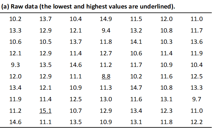
When forming a frequency distribution, the first things to do are to count the number of observations and to identify the lowest and highest values.
[!example]+ Example 2.2 The table below, where haemoglobin has been measured to the nearest 0.1 g/100 ml and the groups 11-, for example, contains all the measurements between 11.0 and 11.9 g/100 ml inclusively.
Then decide whether the data should be grouped, and, if so what grouping interval should be used.
As a rough guide one should aim for 5-20 groups, depending on the number of observations. If the interval chosen for grouping the data is too wide, too much detail will be lost, while if its too narrow the table will be unwieldy. The starting groups should be round numbers and, whenever possible, all the intervals should be of the same width.
There should be no gaps between groups. The table should be labelled so that it is clear what happens to observations that fall on the boundaries.
[!example]+ Example 2.3
For data in the table above an intervals width of 1 g/100 ml were chosen, leading to eight groups in the frequency distribution. Labelling the groups 8-, 9-, . . . is clear. An acceptable alternative would have been 8.0-8.9, 9.0-9.9 and so on.
[!attention]+ Labelling them 8-9, 9-10 and so on would have been confusing, since it would not then be clear to which group a measurement of 9.0 g/100 ml, for example, belonged.
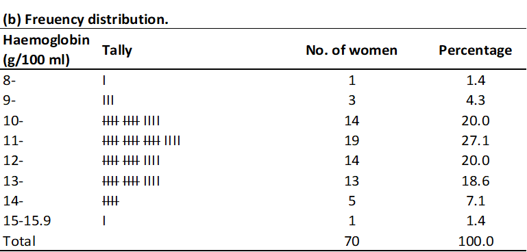
Once the format of the table is decided, the numbers of observations in a each group are counted. Mistakes are most easily avoided by going through the data in order. For each value, a mark is put against the appropriate group.
To facilitate the counting, these marks are arranged in groups of five by putting each fifth mark horizontally through the previous four ( |||| ); these are called five-bar gates. The process is called tallying and is illustrated in Example 2.3.
Histograms
Frequency distributions are usually illustrated by histograms, as shown in the Figure 2.3 below for the haemoglobin data. Either the frequencies or the percentages may be used; the shape of the histogram will be the same.
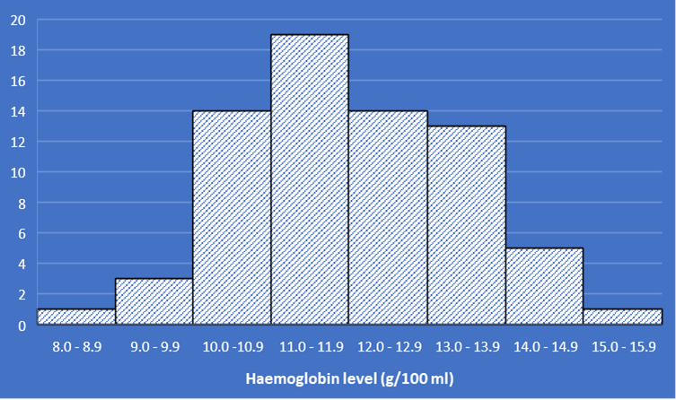
The construction of a histogram is straightforward when the grouping intervals of the frequency distribution are all equal, as is the case in Figure 2.3. If the intervals are of different widths, it is important to take this into account when drawing the histogram, otherwise a distorted picture will be obtained.
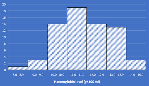
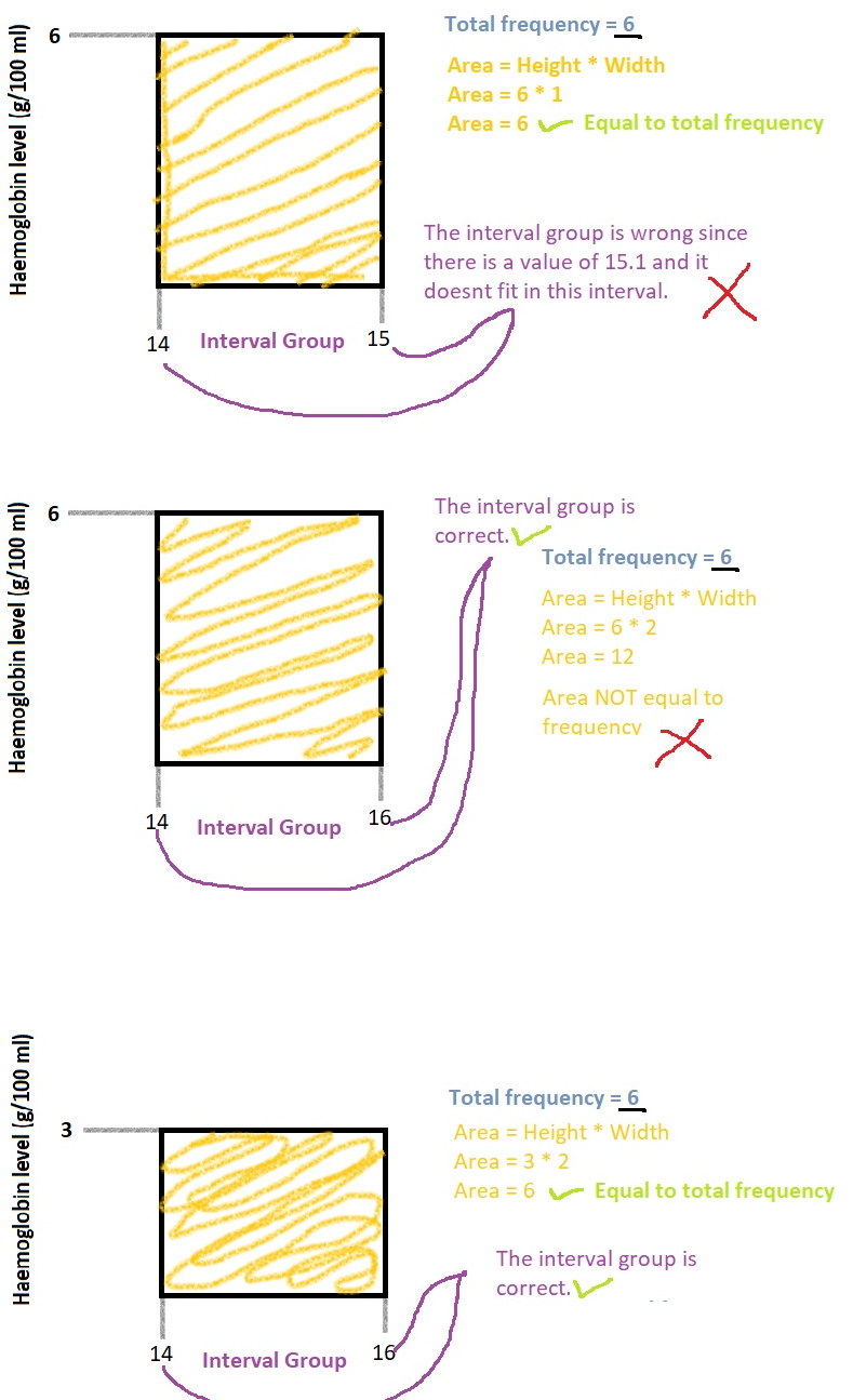
[!example] Example 2.4 Suppose the two highest haemoglobin groups had been combined in compiling the table in Example 2.1. The frequency for this combined group (14.0-15.9 g/100ml) would be 6, but clearly it would be misleading to draw rectangle of height 6 from 14 to 16 g/100 ml.
Since the interval would be twice the width of all the others, the correct height of the line would be 3, half of the total frequency for this groups. This is illustrated in Figure 2.4 below.
The general rule for drawing a histogram when the intervals are not all the same width is to make the height of the rectangles proportional to the frequencies divided by the widths, that is to make the areas of the histogram bars proportional to the frequencies.
[!hint]- Explanation
Frequency polygon
An alternative but less common way of illustrating a frequency distribution is a frequency polygon, as shown in Figure 2.5 below. This is particularly useful when comparing two or more frequency distributions by drawing them on the same diagram.
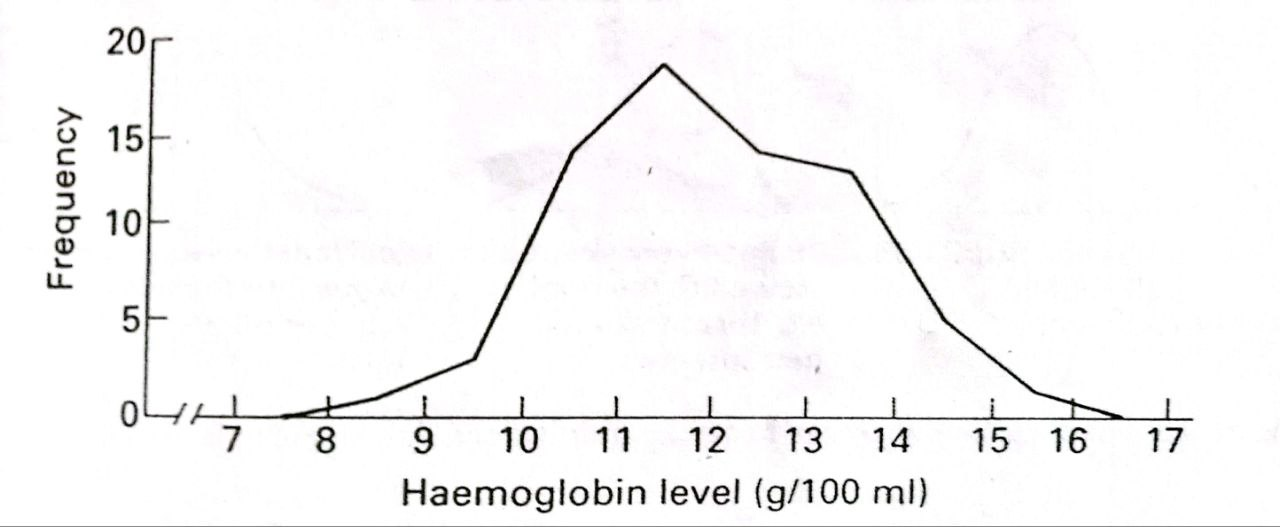
The polygon is drawing by imagining (or lightly penciling) the histogram and joining the mid-points of the tops of its rectangles. The end-points of the resulting line are then joined to the horizontal axis at the mid-point of the groups immediately below and above the lowest and highest non -zero frequencies respectively.
For the haemoglobin data, there are the groups 7.0-7.9 and 16.0-16.9 g/ml. The frequency polygon in Figure 2.4 is therefore joined to the axis at 7.5 and 16.5 g/100 ml.
Frequency Distribution of the Population
Figures 2.3 and 2.5 illustrate the frequency distribution of the haemoglobin levels of a sample of 70 women. We use these data to give us information about the distribution of haemoglobin levels among women in general. For example, it seems uncommon for a woman to have a level below 9.0 g/00 ml or above 15.0 g/100 ml.
Our confidence in drawing general conclusions from the data depends on how many individuals were measured. The larger the sample measured, the finer the grouping interval that can be chosen, so that the histogram (or frequency polygon) becomes smoother and more closely resembles the distribution of the total population.
In the limit, if it were possible to ascertain the haemoglobin levels of the whole population of women, the resulting diagram would a smooth curve.
Shapes of frequency distributions
Figure 2.6 below shows three of the most common shapes of frequency distributions. They all have high frequencies in the center of the distributions and low frequencies at the two extremes, which are called upper and lower tails of the distributions.
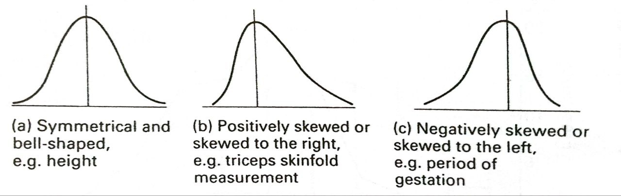
The distribution in Figure 2.6 (a) is symmetrical about the center this shape of curve is often described as ‘bell-shaped’. The two other distributions are asymmetrical or skewed. The upper tail of the distribution in Figure 2.6 (b) is longer than the lower tail; this is called positively skewed or skewed to the right. The distributions in Figure 2.6 (c) is negatively skewed or skewed to the left.
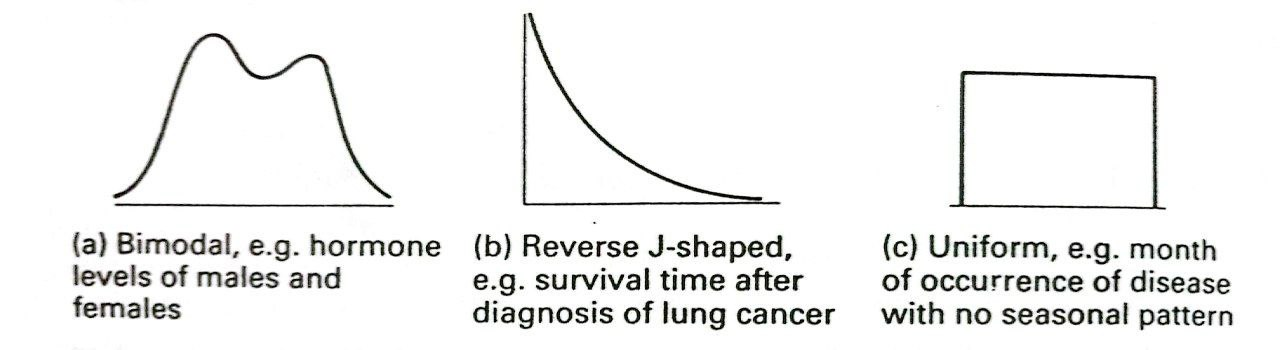
All three distributions in Figure 2.6 are unimodal, that is they have just one peak. Figure 2.7 (a) shows a bimodal frequency distribution, that is a distribution with two peaks. This is occasionally seen and usually indicates that the data are a mixture of two separate distributions.
Also show in Figure 2.7 are two other distributions that are sometimes found; the reverse J-shaped and the uniform distributions.